Getting hot in here
A new domestic heating installation, servicing and maintenance company wanted a brand which would show their high-quality, trustworthy service in a straight-forward no-nonsense approach.
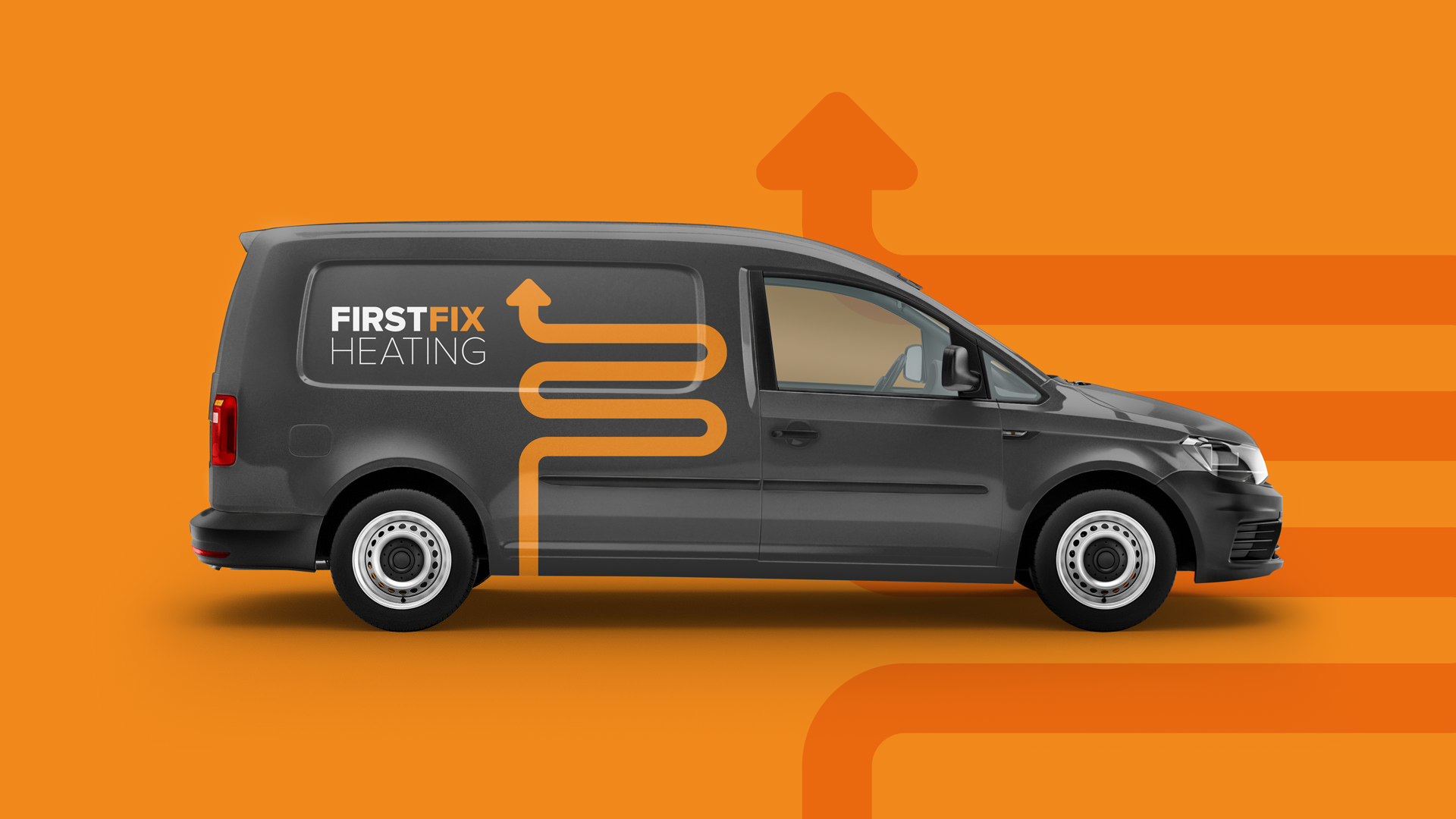
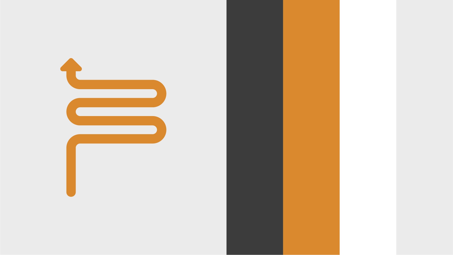
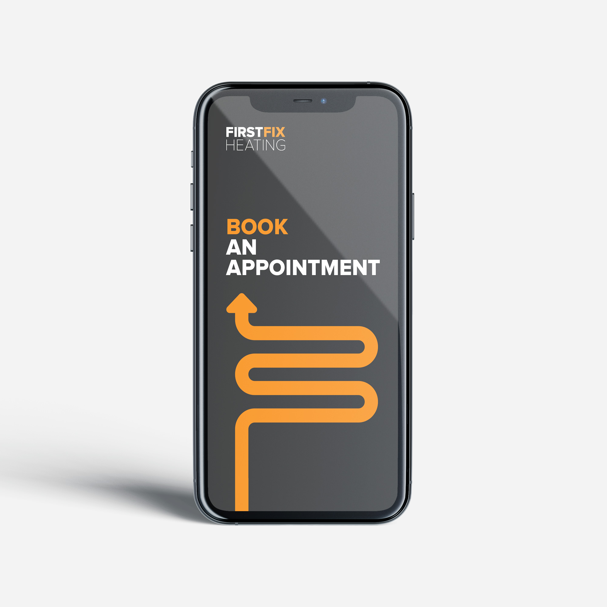
I wanted to create a brand which would stand out from all their competitors – who all seemed to use blue gas flames in their identity. I decided to move away from blue and use an orange and grey palette which feels premium and professional.
The brandmark itself came from the shape of a curved heating element. I took the characteristics of these shapes and created an 'F' mark as the key 'element' of the brand. The arrow links to the idea of 'rising heat' and the thought of fixing/improving/positive results. The contrasting typography is then bold and simple to help bring through the no-nonsense approach.
Client
Firstfix Heating